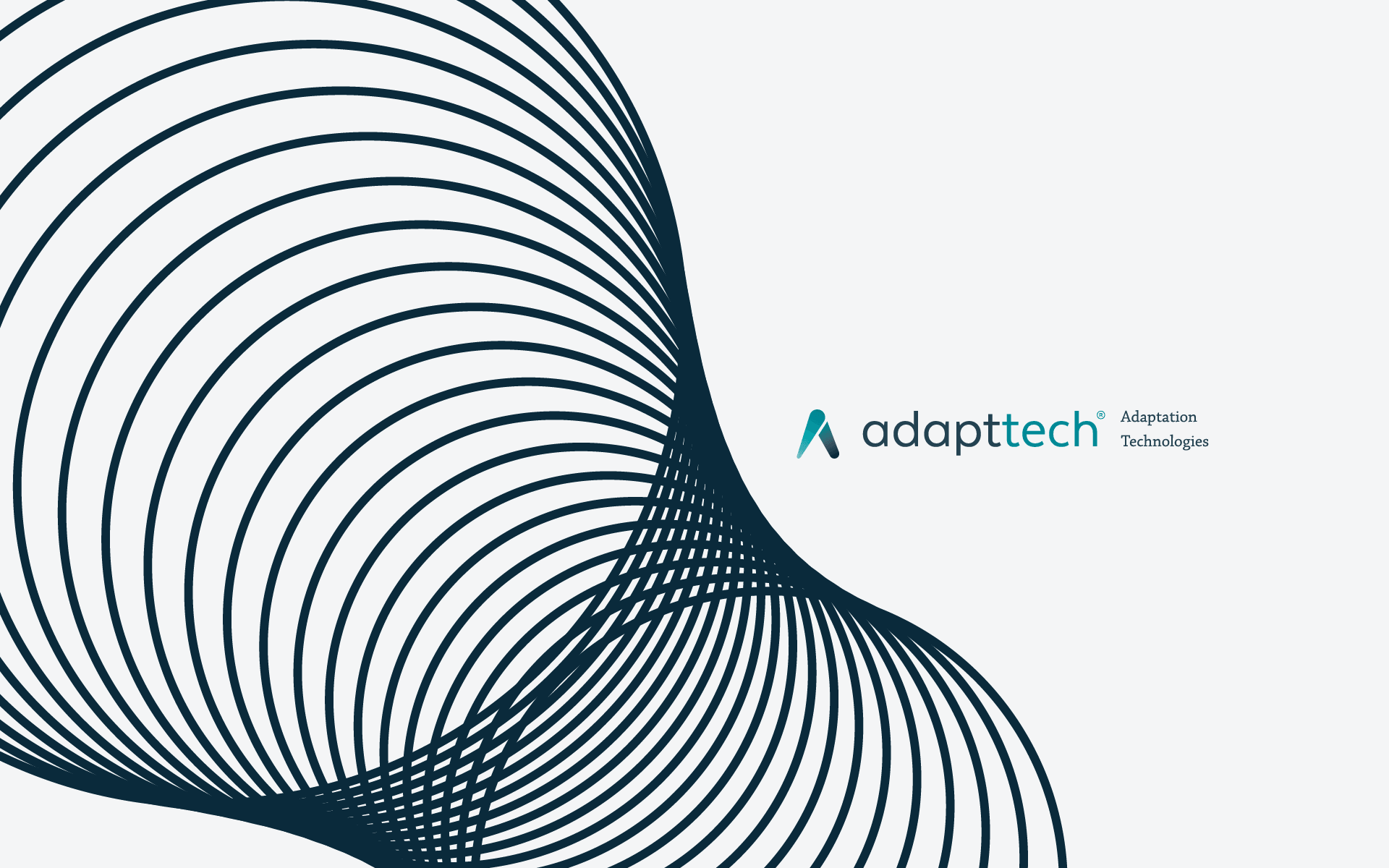

Adapttech
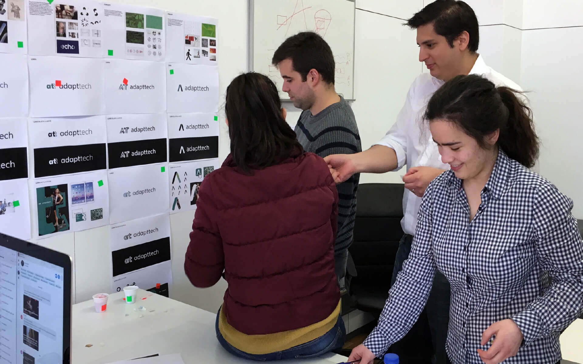
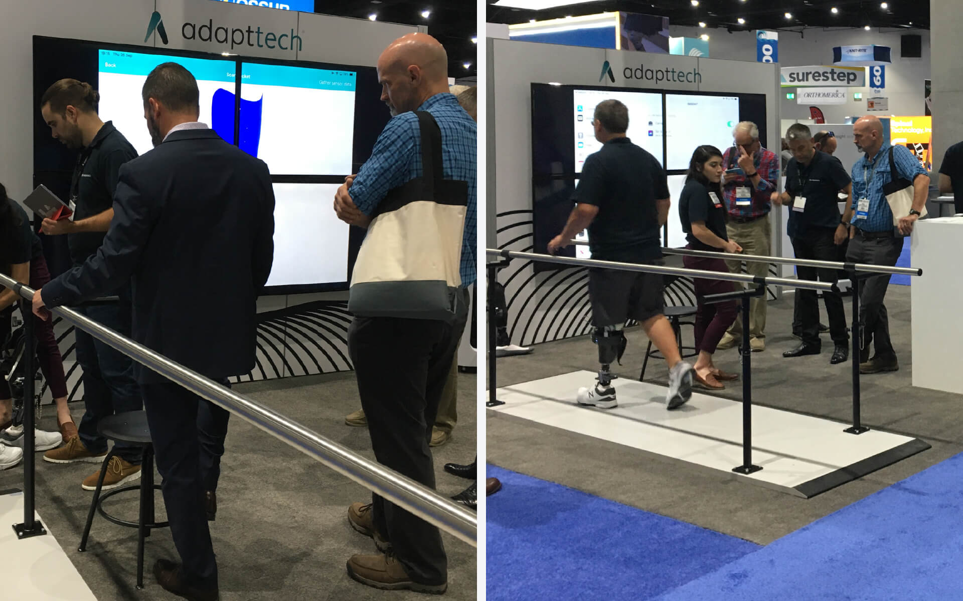
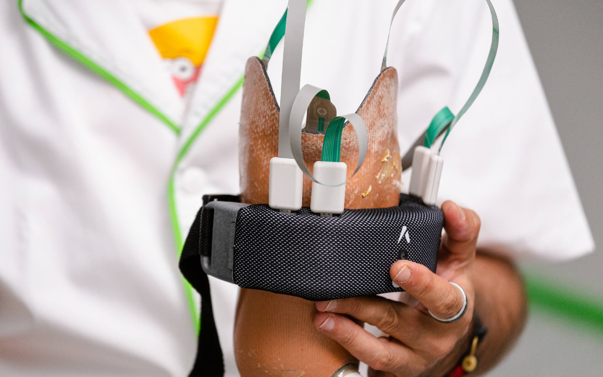
Adapttech exists to improve the prosthetic fitting experience by giving technicians better tools to support recovery with more comfort, accuracy, and care. The mission is deeply human, so the identity had to feel the same: precise, empathetic, and trustworthy.The brand was developed through an inclusive process that brought in perspectives from across the company, not only design. That collaborative approach made the outcome stronger and more representative of the people behind the work.
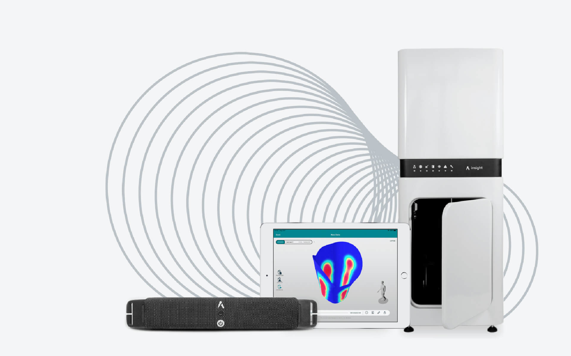
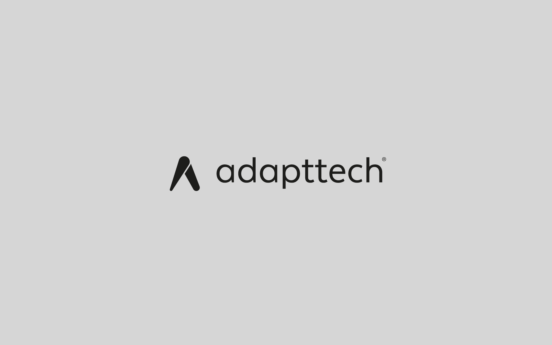
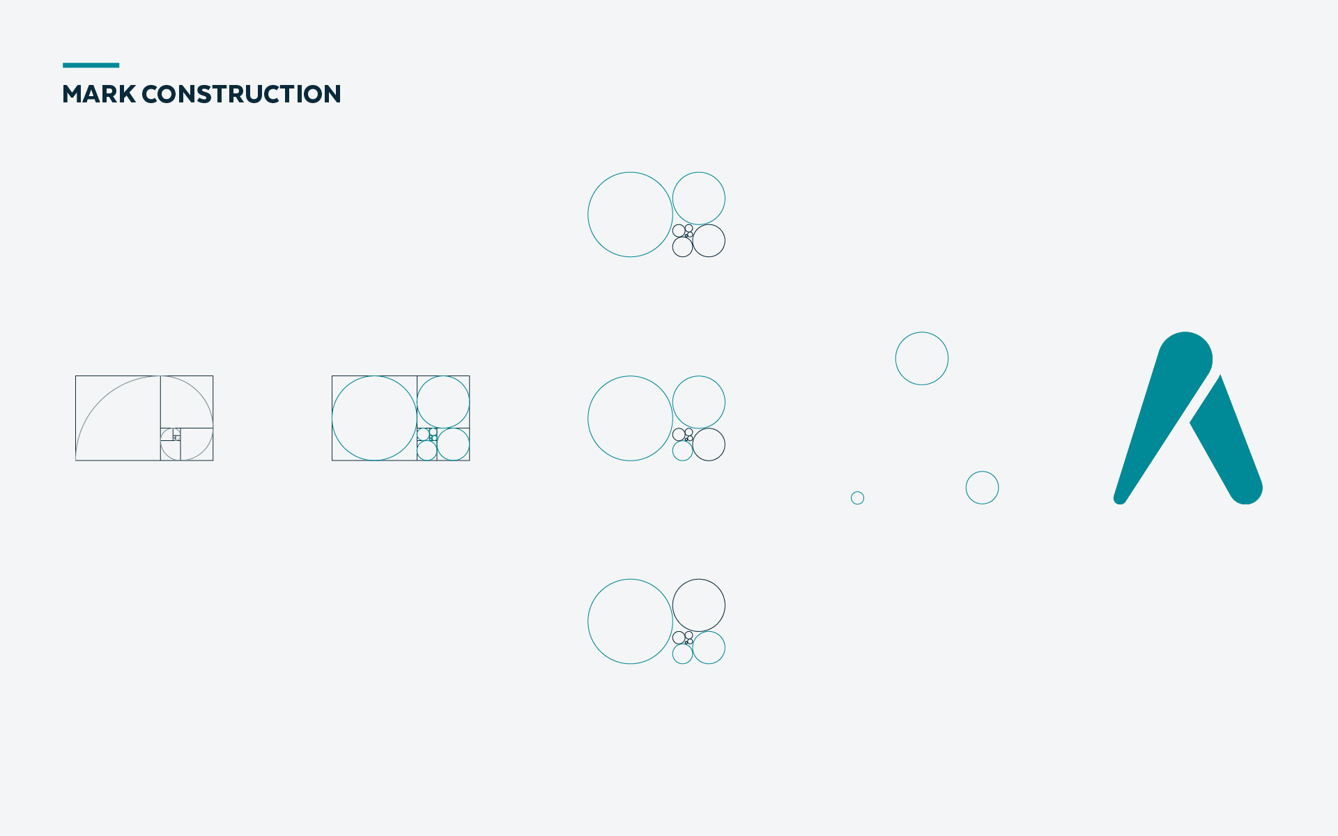
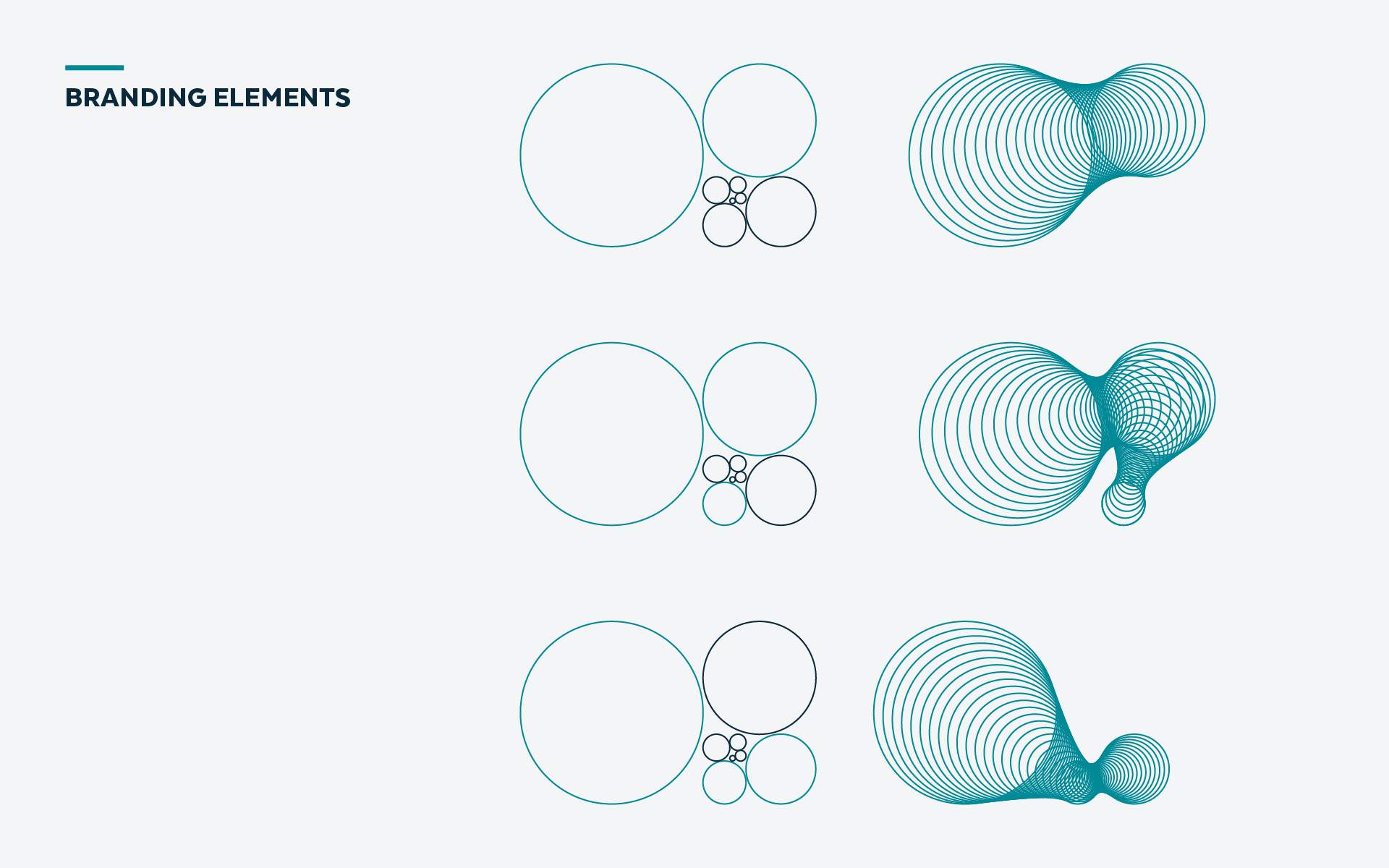
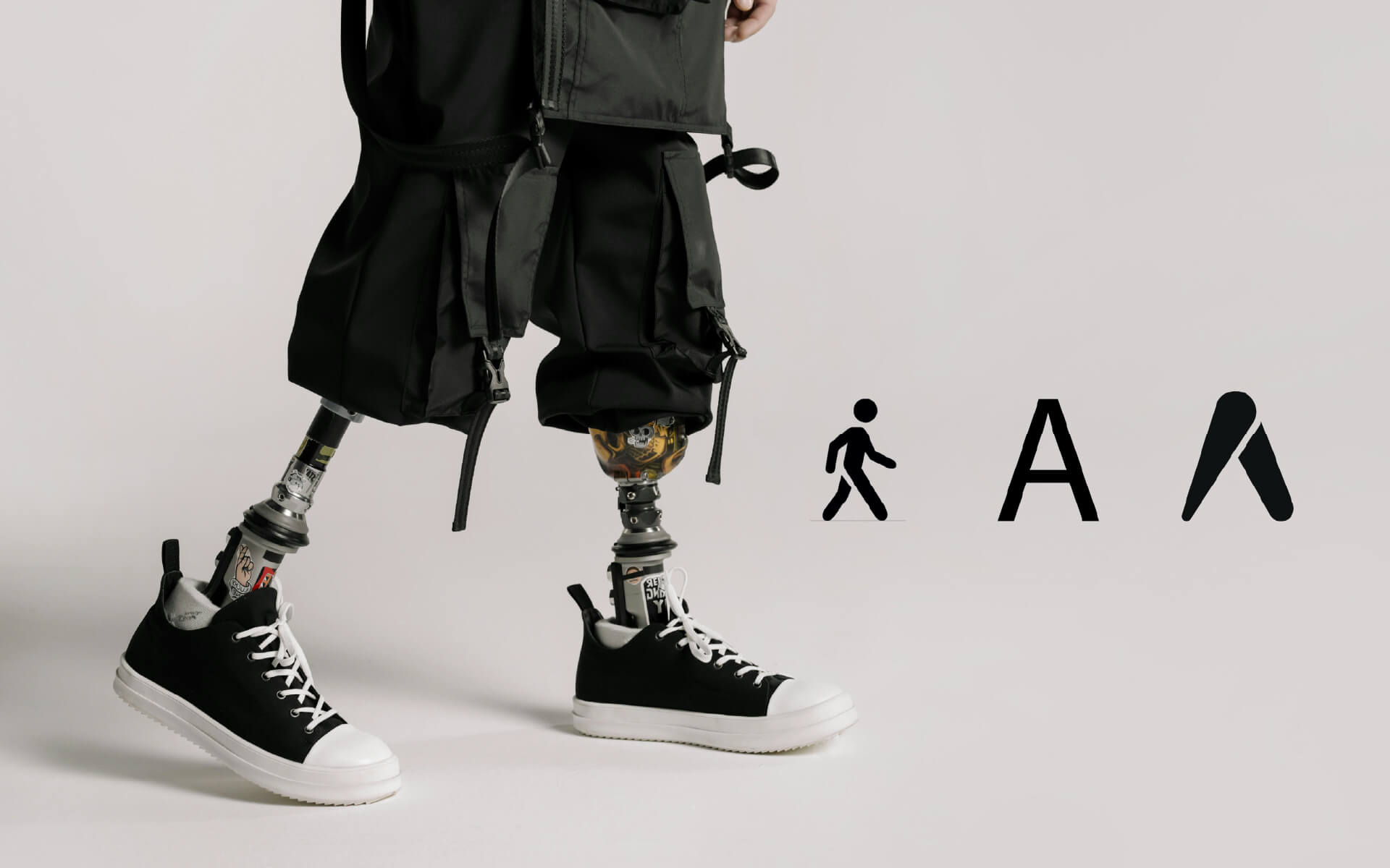
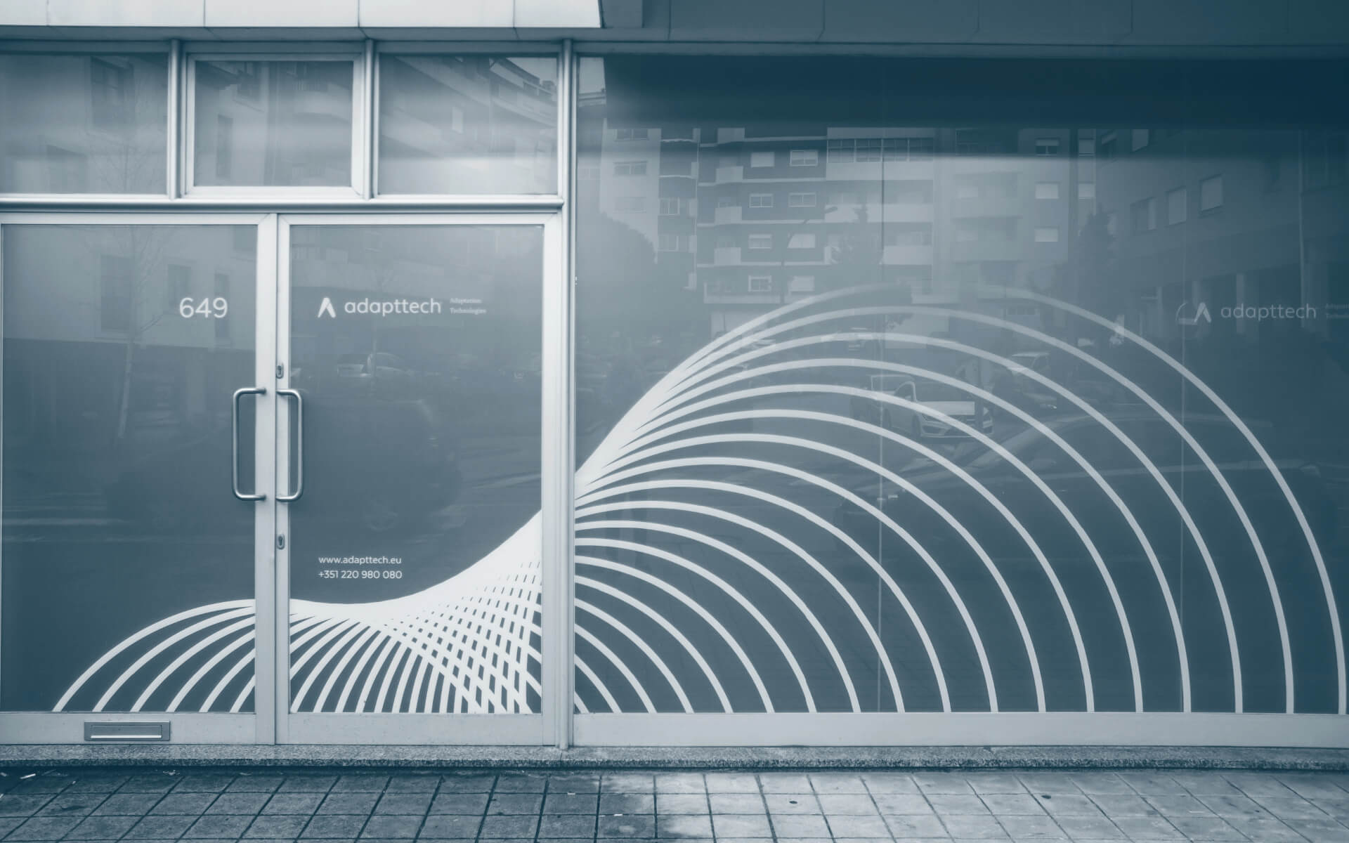
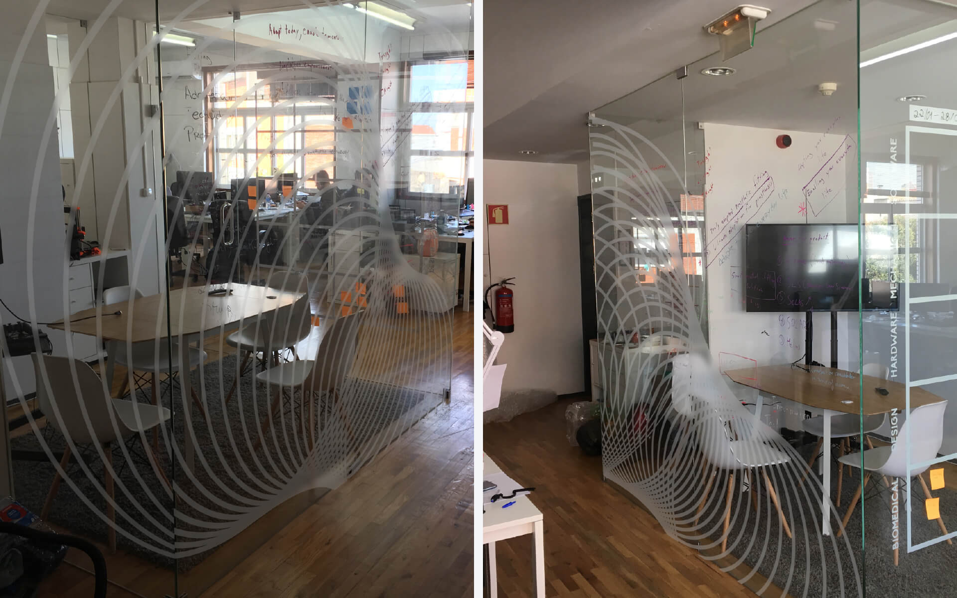
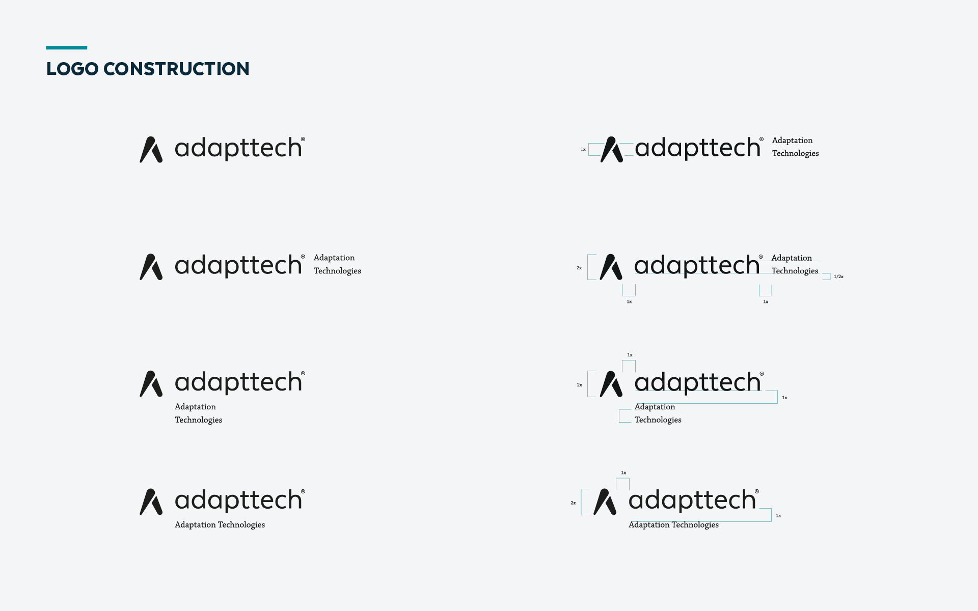
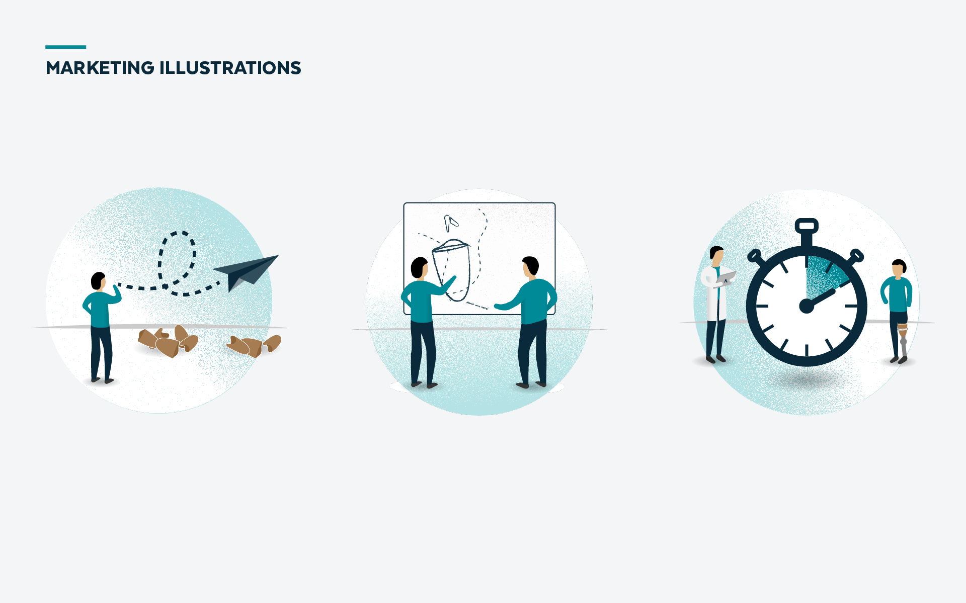
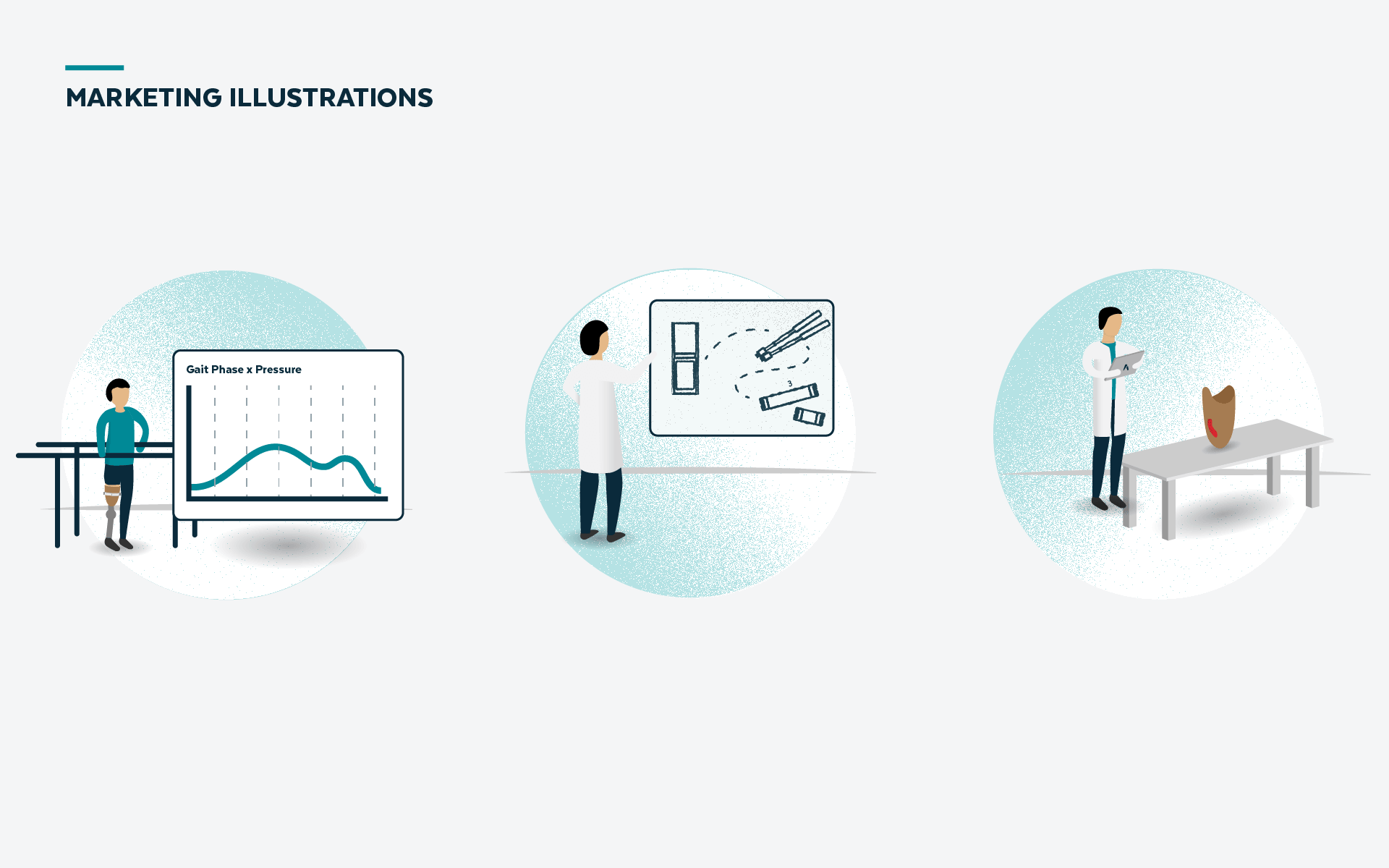
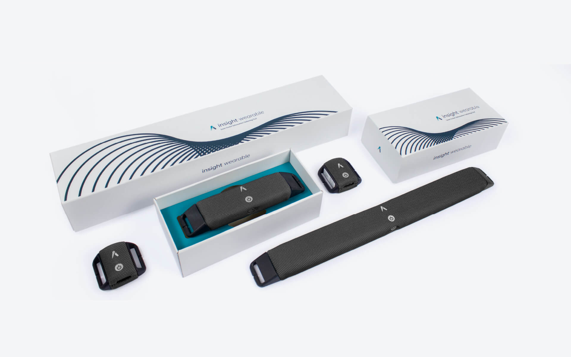
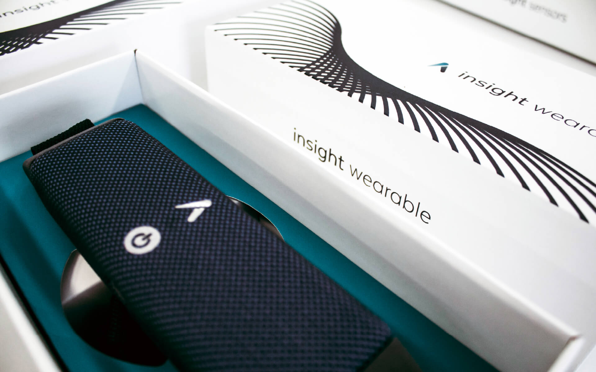
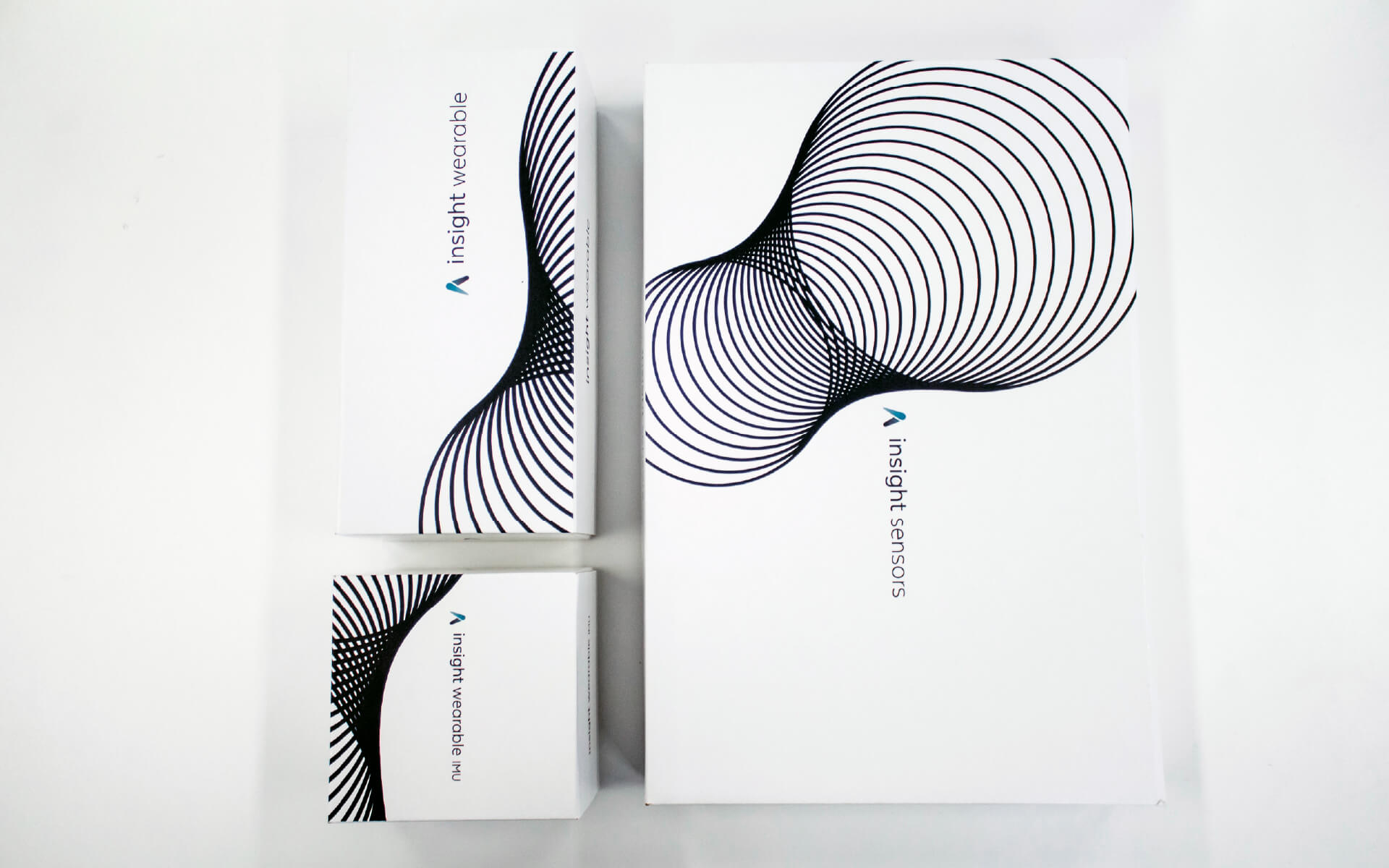
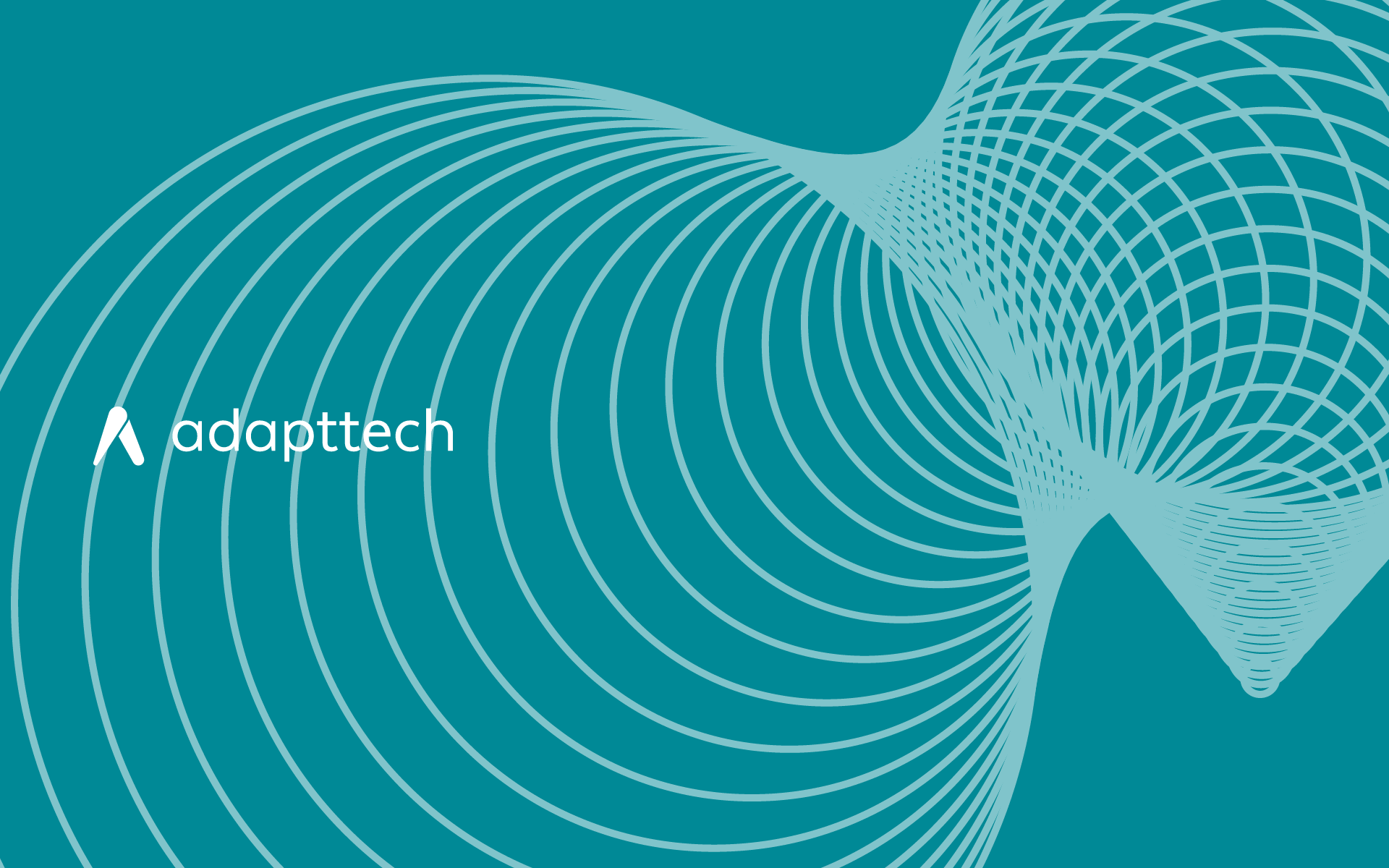
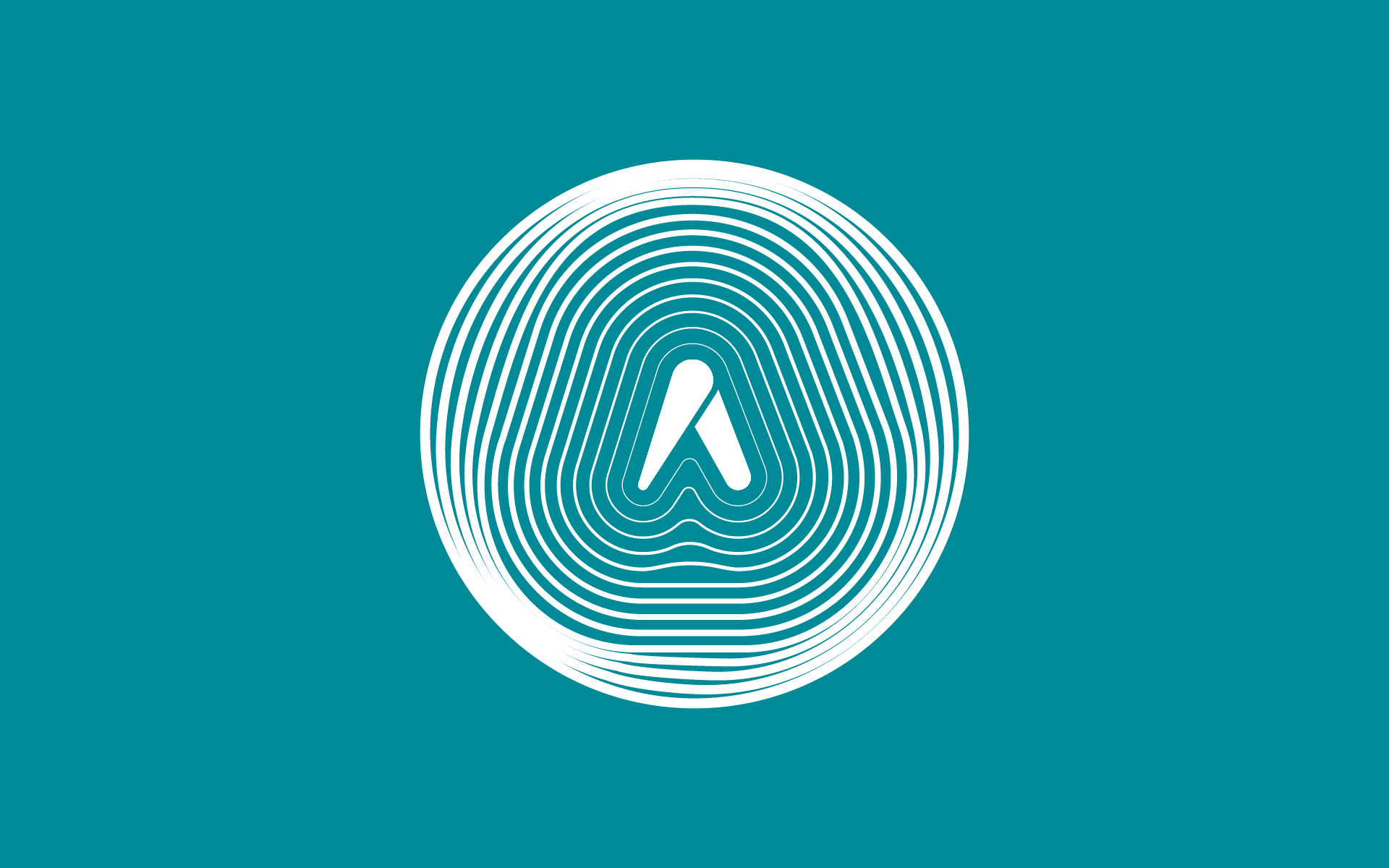
At the center of the identity is a logo that merges two ideas: the silhouette of a person in motion and the letter A formed by the leg, paired with circular lines drawn from the company’s scanning technology. It creates a mark that speaks to mobility, innovation, and human-centered care.
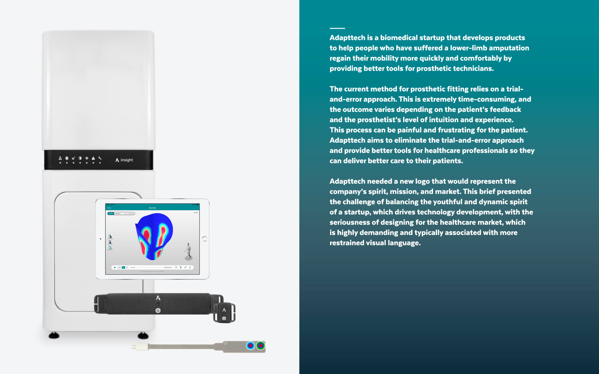
Task
Balance between a disruptive medtech company and a traditional healthcare company